When you are selling your house, posting pictures online is pretty must a must nowadays. Given that there are some big (and little) things you can do to make your house stand out from the competition. Especially if you are dealing in big bucks, there is no reason why your house should have anything to detract.
So, as an example of some things NOT to do, here are a few pictures from 1100 Magnolia Lane, Brookneal, VA - a house (er, estate) listed for $5.5 million we can learn a few things from.
Little thing: if you have candle holders, especially mounted ones, they need to have candles in them.
Big thing: if you have a fire place, there should be a fire going.
Nit-picky: if you have similar artwork, if should look balanced, pink & yellow is unbalanced.
Little thing: Showing off the hand-carved mantel from the mid-1800s is a great idea, so actually get something besides a chip in the paint in focus. The corner is a good option. Speaking of chips in paint - if you're going to focus on details, make sure they look pristine. There is no reason for chips in the paint ... especially in a house of this caliber.
Big thing: I like this picture, overall, but the bottom hanging down on the settee? Tacky. A couple staples would give at least a temporary fix, and not distract from the room as whole.
Little thing: I previously mentioned that candle holders should have candles in them - in the far corner of the room, this candelabra DOES have candles in it, but they are haphazard. It doesn't take that long to make sure they are straight, and then it looks nice, not like a school child's pencil holder. Little things are important.
Unsure: A good rule of thumb is that if there is a light, it should be on for pictures, so I'm a little conflicted about this one. I think another rule of thumb is that if you're going to get a headache from the picture because of the light you should get a different bulb, or keep it off. The reflective paint/wallpaper with the highly yellow light is just not a good combination.
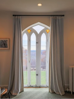
Little thing: Symmetry is important - make sure your curtains are pushed back equally, especially if you are showcasing beautiful doors.
Big thing: Make sure your doors aren't in distracting need of some touch up paint. It happens naturally, but speaks negatively about the condition of the house.
Really big thing: This, I believe, is one of the guest houses on the property. Power wash the mildew from the steps (or where ever it may be). It's presence is really not a good way to attract buyers.
Little thing: Highlighting a fountain? Make sure it's filled with water ... and running.
If you look through all 45 pictures (which still leaves a LOT unknown about the property!!!) on the link I provided above, you'll see they did do somethings right. Some things they did wrong more than once, and I only highlight it one time.
But what do you think? Do the big and little problems I point out stand out to you when you look at houses online?


No comments:
Post a Comment
Thanks for your comment - profit comes with an exchange of ideas.